Pie Chart
In Academic Task 1 of the Writing module, you are expected to write a short descriptive report based on visual information or data. This visual information may be presented as pie charts. Pie charts are circular charts divided into sectors or ‘pie slices’, usually illustrating percentages. The size of each pie slice shows the relative quantity of the data it represents. Together, the slices create a full circle. They are commonly used in the business world and the mass media, and are less common in scientific or technical publications.
Sample Questions
Accessing the news in Canada and Australia
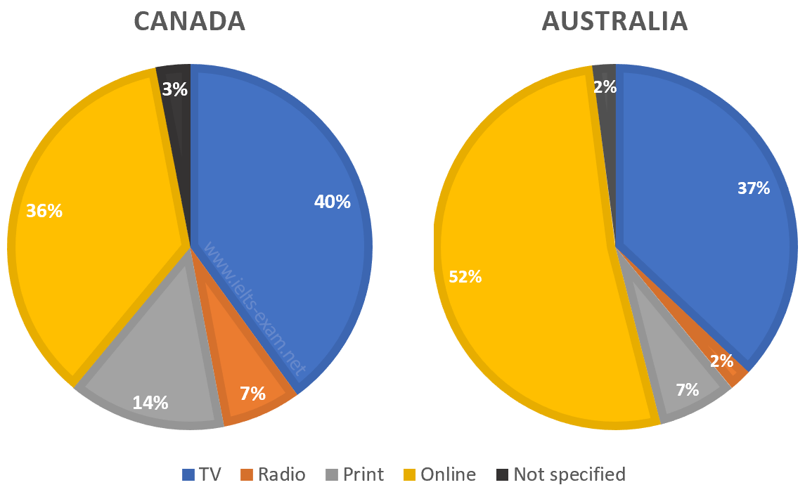
The pie charts compare ways of accessing the news in Canada and Australia.
Summarise the information by selecting and reporting the main features, and make comparisons where relevant.
Employment sectors of graduates from Brighton University, 2019
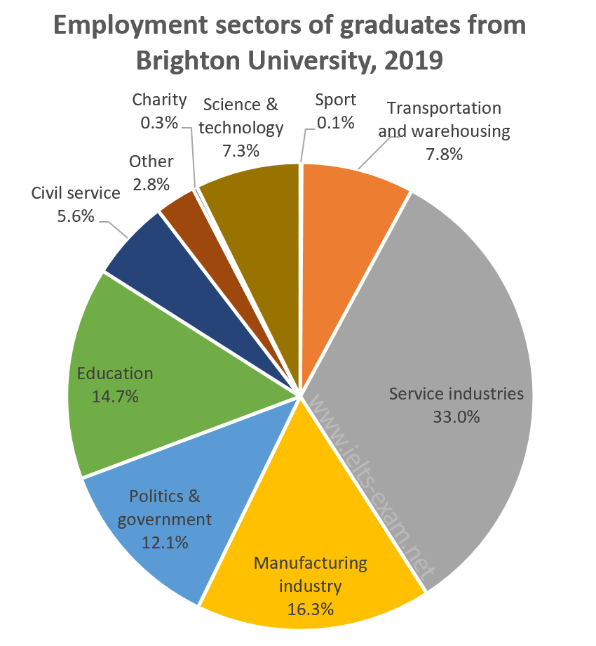
The chart below shows the proportions of graduates from Brighton University in 2019 entering different employment sectors.
Summarise the information by selecting and reporting the main features, and make comparisons where relevant.
The devices people use to watch television in Canada
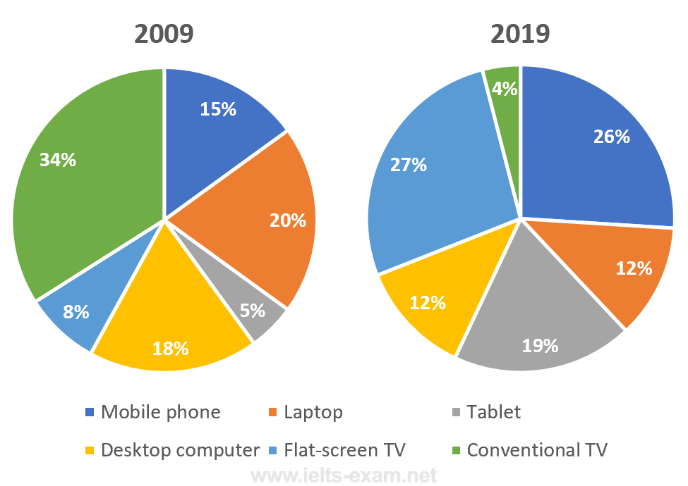
The pie charts below show the devices people in the 18 to 25 age group use to watch television in Canada in two different years.
Summarise the information by selecting and reporting the main features, and make comparisons where relevant.
World passenger car production, 2015
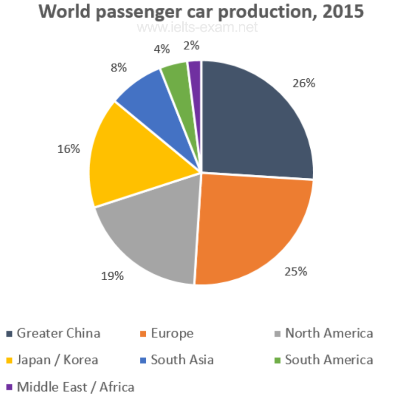
The graph shows data on the manufacture of passenger cars in 2015.
Summarise the information by selecting and reporting the main features, and make comparisons where relevant.
The post-school qualifications held by Canadians
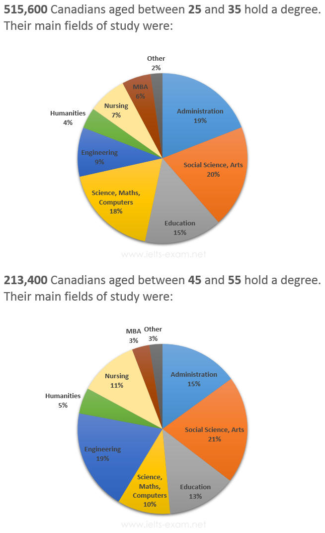
The graphs below show the post-school qualifications held by Canadians in the age groups 25 to 35 and 45 to 55.
Summarise the information by selecting and reporting the main features, and make comparisons where relevant.
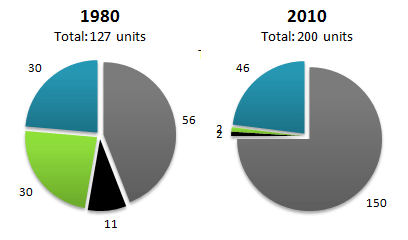
Government expenditure in 2010 and 2015
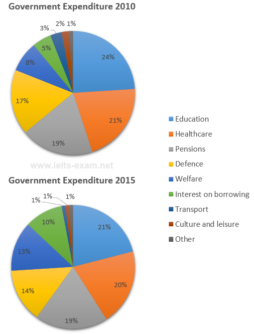
The charts below show local government expenditure in 2010 and 2015.
Summarise the information by selecting and reporting the main features, and make comparisons where relevant.
Most common advantages and disadvantages of Bowen Island
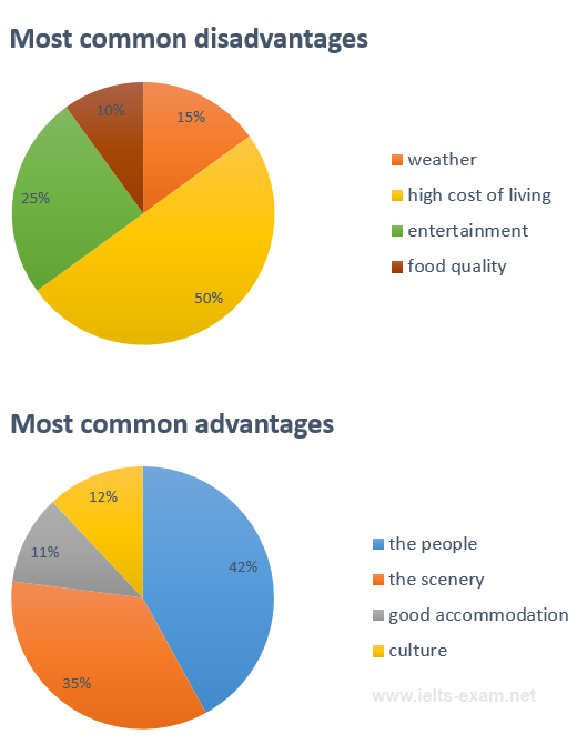
The pie charts below show the most common advantages and disadvantages of Bowen Island, according to a survey of visitors.
Summarise the information by selecting and reporting the main features, and make comparisons where relevant.
Number of journal articles read per week by all students, PhD students, and junior lecturers
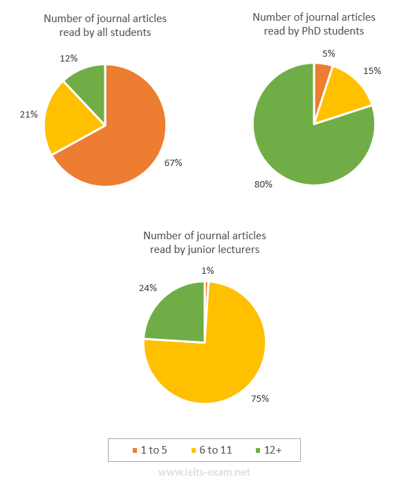
The pie charts below illustrate the number of journal articles read per week by all students, PhD students, and junior lecturers at an Australian university.
Summarise the information by selecting and reporting the main features, and make comparisons where relevant.
Reasons for cycling to work
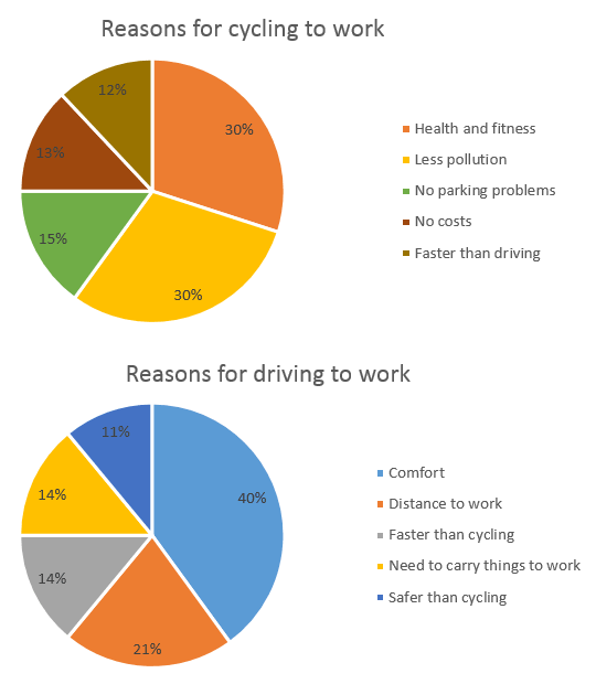
The charts below show the reasons why people travel to work by bicycle or by car.
Summarise the information by selecting and reporting the main features, and make comparisons where relevant.
Causes of worldwide land degradation
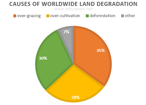
The pie chart below shows the main reasons why agricultural land becomes less productive. The table shows how these causes affected three regions of the world during the 1990s.
Summarise the information by selecting and reporting the main features, and make comparisons where relevant.
What makes people most happy?
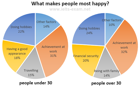
The charts below show the results of a survey about what people of different age groups say makes them most happy.
Summarise the information by selecting and reporting the main features, and make comparisons where relevant.
Average Household Expenditures by Major Category
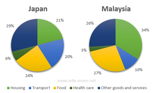
The pie charts below show the average household expenditures in Japan and Malaysia in the year 2010.
Summarise the information by selecting and reporting the main features, and make comparisons where relevant.
Employees and self-employed: by sex and occupation, 1992
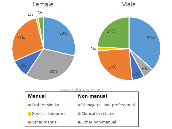
The two pie charts below show some employment patterns in Great Britain in 1992.
Summarise the information by selecting and reporting the main features, and make comparisons where relevant.
Online sales for retail sectors in Canada
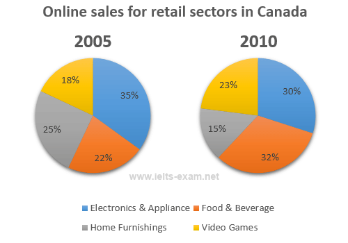
The two pie charts show the online shopping sales for retail sectors in Canada in 2005 and 2010.
Summarise the information by selecting and reporting the main features, and make comparisons where relevant.
Expenditure by local authorities in Someland
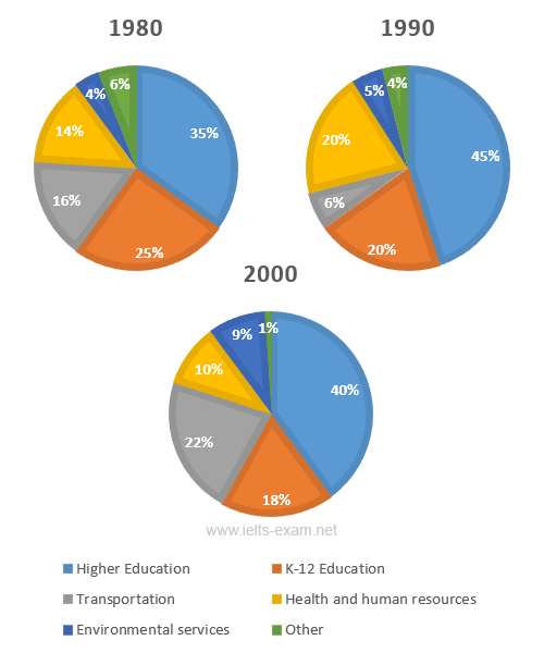
The three pie charts show the changes in annual spending by local authorities in Someland in 1980, 1990 and 2000.
Summarise the information by selecting and reporting the main features, and make comparisons where relevant.
Transport and car use in Edmonton
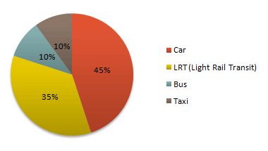
The diagrams give information on transport and car use in Edmonton.
Summarise the information by selecting and reporting the main features, and make comparisons where relevant.
Managing Finances
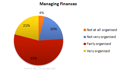
The diagrams show UK students' responses to the question of to what extent would they describe themselves as financially organised.
Summarise the information by selecting and reporting the main features, and make comparisons where relevant.
World population by region, 1900 and 2000
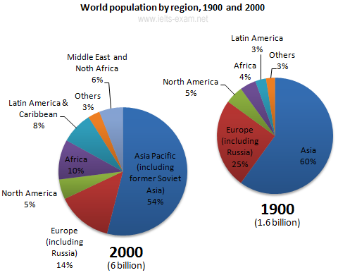
The pie charts give information about world population in 1900 and 2000.
Summarise the information by selecting and reporting the main features, and make comparisons where relevant.
Average Household Expenditure by Major Category
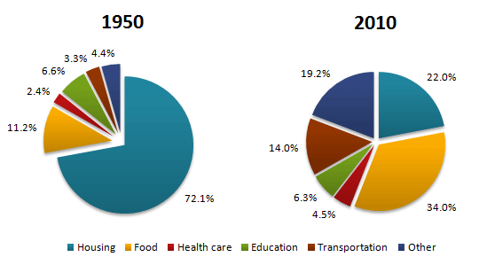
The pie charts show the average household expenditures in a country in 1950 and 2010.
Summarise the information by selecting and reporting the main features, and make comparisons where relevant.
Projected market share of the two companies in jeans
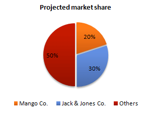
The pie chart shows the projected market share of the two companies in jeans at the end of next year.
Summarise the information by selecting and reporting the main features, and make comparisons where relevant.
Electricity generation by source in New Zealand and Germany in 1980 and 2010
The pie charts show electricity generation by source in New Zealand and Germany in 1980 and 2010.
Summarise the information by selecting and reporting the main features, and make comparisons where relevant.