Line Graph
Line graphs can be used to show how information or data change over time. They have an x-axis (horizontal) and y-axis (vertical). Usually the x-axis shows the time period and the y-axis shows what is being measured. Line graphs can be used when you are plotting data that have peaks (ups) and troughs (downs). In other words, they highlight trends.
Sample Questions
Birth and death rates in New Zealand
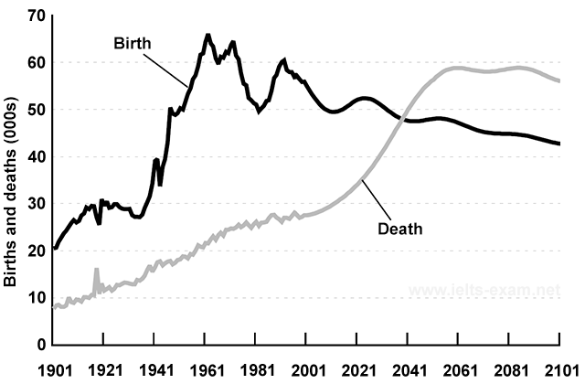
The graph gives information about changes in the birth and death rates in New Zealand between 1901 and 2101.
Summarise the information by selecting and reporting the main features, and make comparisons where relevant.
Free time activities of the elderly in the U.S.
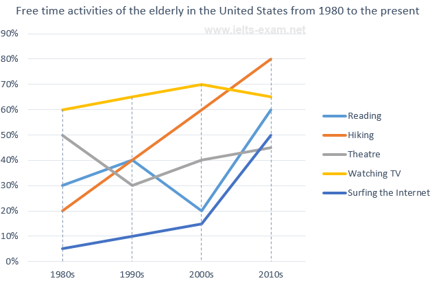
The graph shows how elderly people in the United States spent their free time between 1980 and 2010.
Summarise the information by selecting and reporting the main features, and make comparisons where relevant.
Population growth in India and China
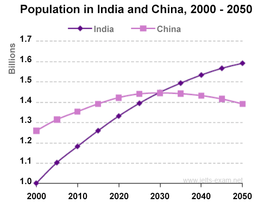
The graph shows population figures for India and China since the year 2000 and predicted population growth up until 2050.
Summarise the information by selecting and reporting the main features, and make comparisons where relevant.
Pollution levels in London, micrograms per cubic metre
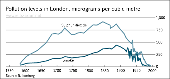
The graph shows the pollution levels in London between 1600 and 2000.
Summarise the information by selecting and reporting the main features, and make comparisons where relevant.
Changes in the price of fresh fruits and vegetables
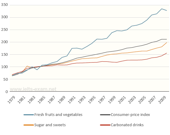
The graph shows relative price changes for fresh fruits and vegetables, sugars and sweets, and carbonated drinks between 1978 and 2009.
Summarise the information by selecting and reporting the main features, and make comparisons where relevant.
The number of books read at Burnaby Public Library
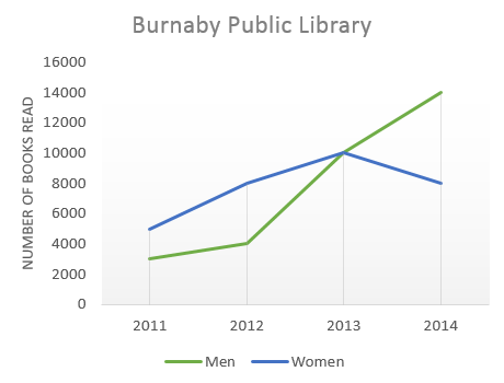
The graph shows the number of books read by men and women at Burnaby Public Library from 2011 to 2014.
Summarise the information by selecting and reporting the main features, and make comparisons where relevant.
Attractions in Brighton
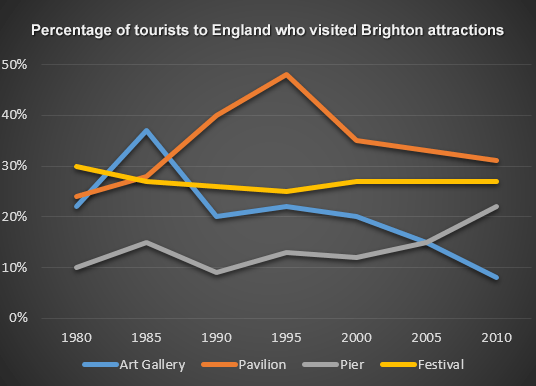
The line graph shows the percentage of tourists to England who visited four different attractions in Brighton.
Summarise the information by selecting and reporting the main features, and make comparisons where relevant.
Outokumpu share price
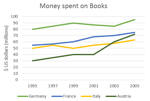
The graph shows the amount of money spent on books in Germany, France, Italy and Austria between 1995 and 2005.
Summarise the information by selecting and reporting the main features, and make comparisons where relevant.
Population change between 1940 and 2000 in the U.S.
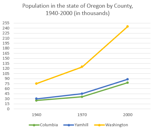
The graph shows the population change between 1940 and 2000 in three different counties in the U.S. state of Oregon.
Summarise the information by selecting and reporting the main features, and make comparisons where relevant.
Food consumption in China, 1985-2010
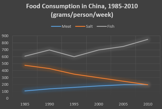
The graph shows the changes in food consumption by Chinese people between 1985 and 2010.
Summarise the information by selecting and reporting the main features, and make comparisons where relevant.
Number of visitors per month in summer, 2013
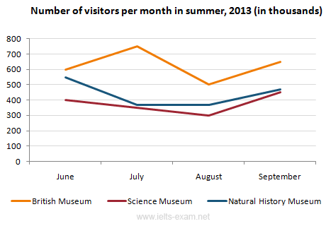
The line graph gives information about the number of visitors to three London museums between June and September 2013.
Summarise the information by selecting and reporting the main features, and make comparisons where relevant.
National Recycling Rates, 1960 to 2011
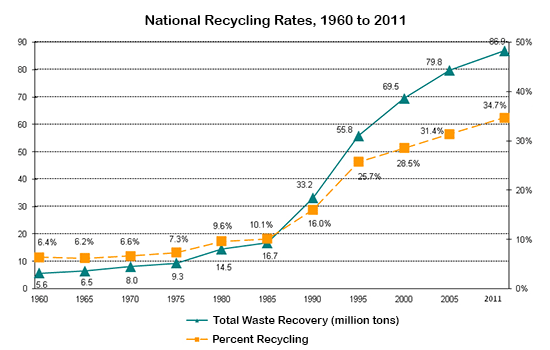
The graph shows waste recycling rates in the U.S. from 1960 to 2011.
Summarise the information by selecting and reporting the main features, and make comparisons where relevant.
World Population Growth 1800-2100
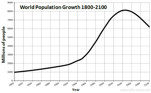
The graphs provide information on global population figures and figures for urban populations in different world regions.
Summarise the information by selecting and reporting the main features, and make comparisons where relevant.
U.S. Energy Consumption by Fuel
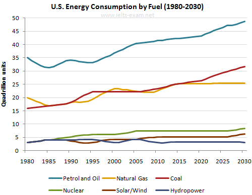
The graph gives information from Annual Energy Outlook 2008 about consumption of energy in the USA since 1980 with projection until 2030.
Summarise the information by selecting and reporting the main features, and make comparisons where relevant.
International Tourist Arrivals
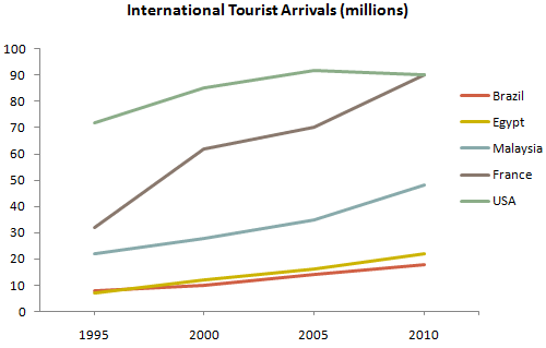
The graph gives information about international tourist arrivals in five countries.
Summarise the information by selecting and reporting the main features, and make comparisons where relevant.
Population of turtles in India: 1980-2012
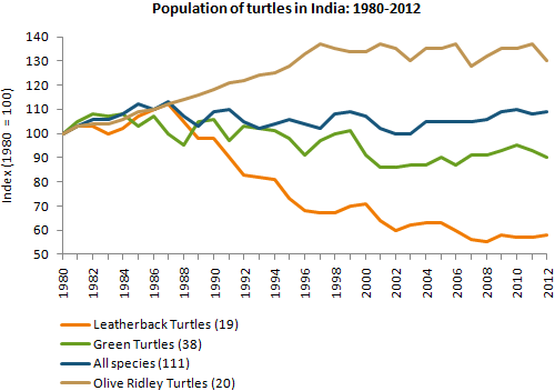
The graph shows the population figures of different types of turtles in India between 1980 and 2012.
Summarise the information by selecting and reporting the main features, and make comparisons where relevant.
Channel one news viewing figures
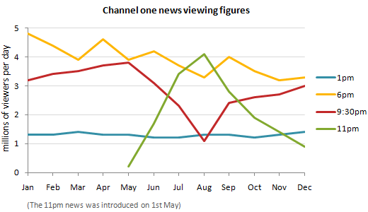
Write a report for a university lecturer describing the information in the graph.
Summarise the information by selecting and reporting the main features, and make comparisons where relevant.