Bar Chart
It is common in the IELTS Writing paper to be asked to describe a bar graph. Bar graphs, also known as bar charts, are similar to line graphs in that they have two axes and are useful for showing how something has changed over a given period of time, especially when there are significant changes. Bar graphs consist of rectangular bars, which can be orientated horizontally or vertically, with the lengths proportional to the data values that they represent. They are typically used for comparing two or more values.
Sample Questions
The age of the population of Iceland between 1990 and 2020
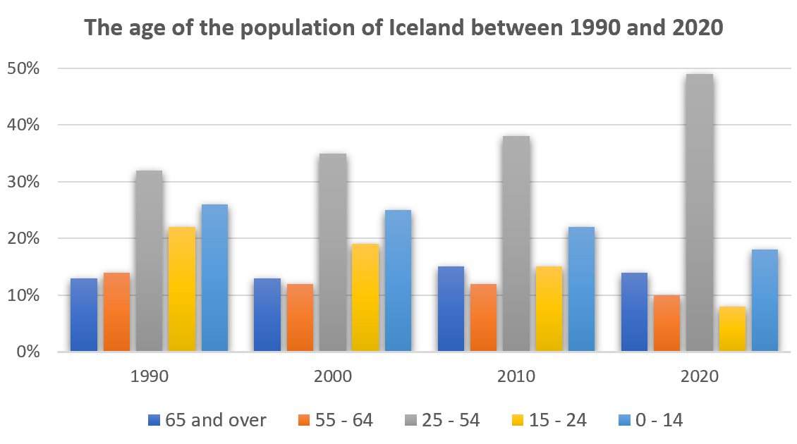
The graph gives information about the age of the population of Iceland between 1990 and 2020.
Summarise the information by selecting and reporting the main features, and make comparisons where relevant.
The percentage of women going into higher education in five countries
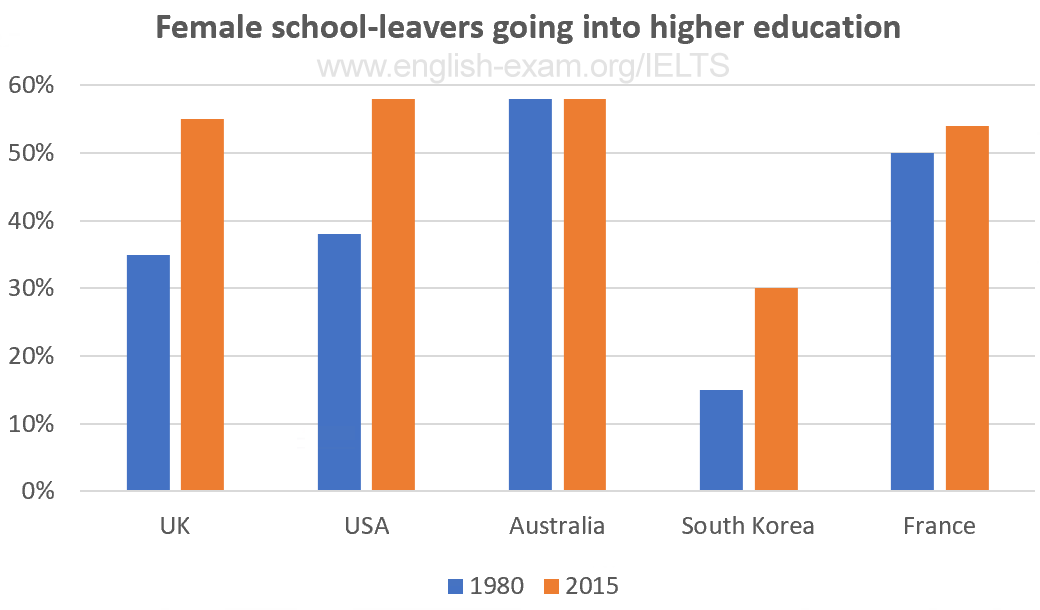
The chart gives information on the percentage of women going into higher education in five countries for the years 1980 and 2015.
Summarise the information by selecting and reporting the main features, and make comparisons where relevant.
Participants who have entered the Olympics since it began
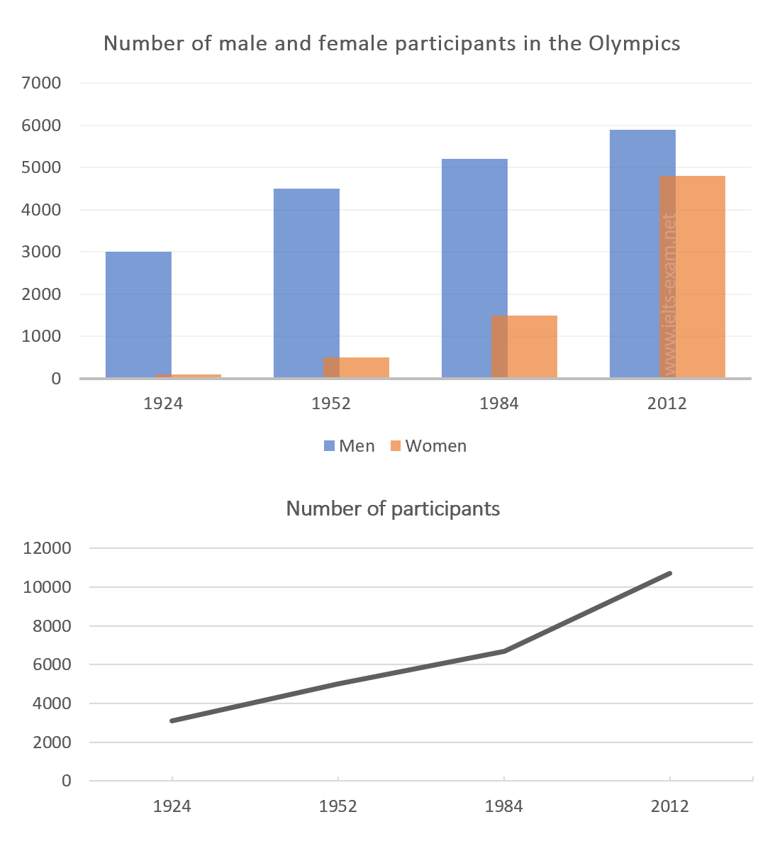
The chart and graph below give information about participants who have entered the Olympics since it began.
Summarise the information by selecting and reporting the main features, and make comparisons where relevant.
Road transport in a number of European countries
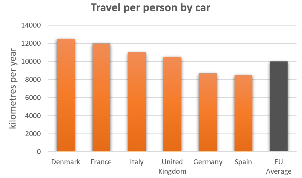
The bar charts below give information on road transport in a number of European countries.
Summarise the information by selecting and reporting the main features, and make comparisons where relevant.
The percentage of part-time workers in each country of the United Kingdom
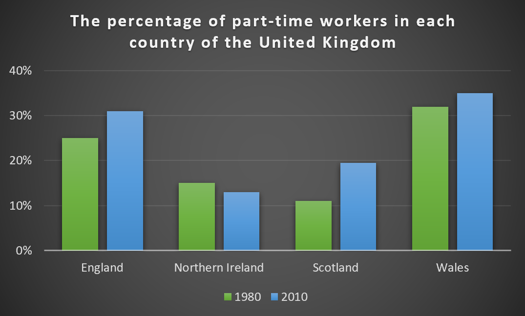
The graph below shows the percentage of part-time workers in each country of the United Kingdom in 1980 and 2010.
Summarise the information by selecting and reporting the main features, and make comparisons where relevant.
Industries’ percentage share of Brazil’s economy
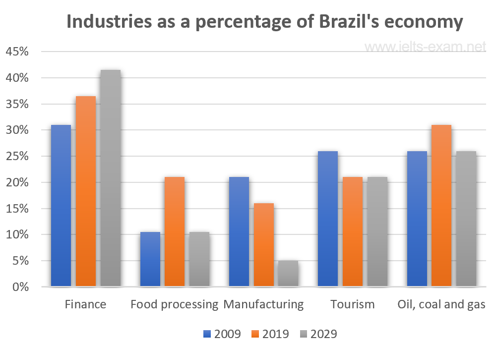
The bar chart below illustrates five different industries’ percentage share of Brazil’s economy in 2009 and 2019 with a forecast for 2029.
Summarise the information by selecting and reporting the main features, and make comparisons where relevant.
The percentages of men and women in employment
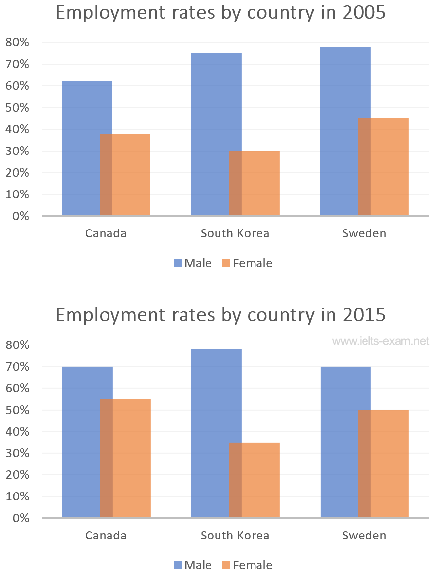
The bar charts below show the percentages of men and women in employment in three countries in 2005 and 2015.
Summarise the information by selecting and reporting the main features, and make comparisons where relevant.
The number of medals won by the top five countries in the summer and winter Olympics
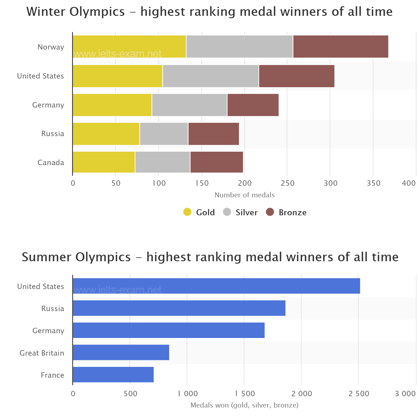
The graphs below show the number of medals won by the top five countries in the summer and winter Olympics.
Summarise the information by selecting and reporting the main features, and make comparisons where relevant.
Global population percentages and distribution of wealth by region
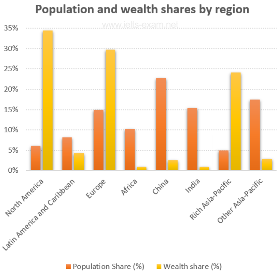
The chart below gives information about global population percentages and distribution of wealth by region.
Summarise the information by selecting and reporting the main features, and make comparisons where relevant.
Percentage of Canadians gave money to charitable organisations
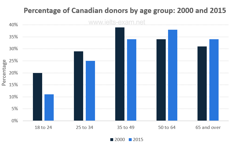
The chart below gives information on the percentage of Canadians gave money to charitable organisations by age range for the years 2000 and 2015.
Summarise the information by selecting and reporting the main features, and make comparisons where relevant.
Employment figures in different tourism-related industries
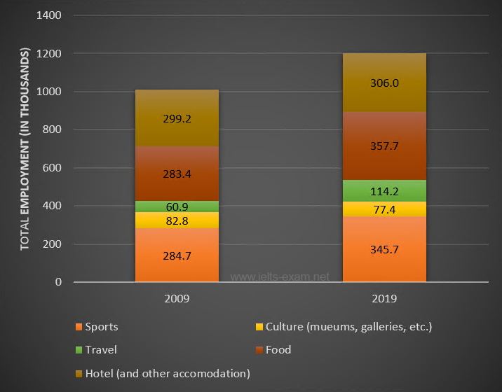
The bar chart below shows employment figures in different tourism-related industries between 2009 and 2019.
Summarise the information by selecting and reporting the main features, and make comparisons where relevant.
The main reasons workers chose to work from home
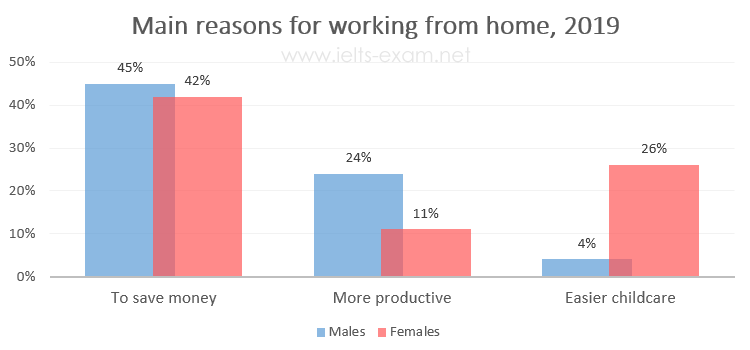
The diagrams below show the main reasons workers chose to work from home and the hours males and females worked at home for the year 2019.
Summarise the information by selecting and reporting the main features, and make comparisons where relevant.
Percentage of the population living in urban areas
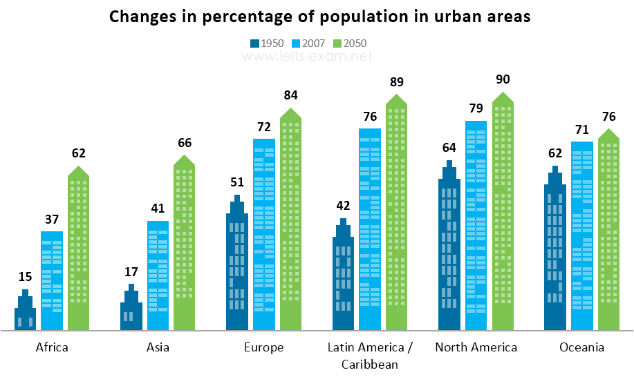
The bar chart below gives information about the percentage of the population living in urban areas in different parts of the world.
Summarise the information by selecting and reporting the main features, and make comparisons where relevant.
Car journeys into the city centre
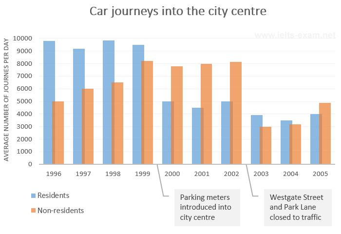
The bar chart gives information about the number of car journeys into the city centre made by residents and non-residents.
Summarise the information by selecting and reporting the main features, and make comparisons where relevant.
The places visited by different people living in Canada
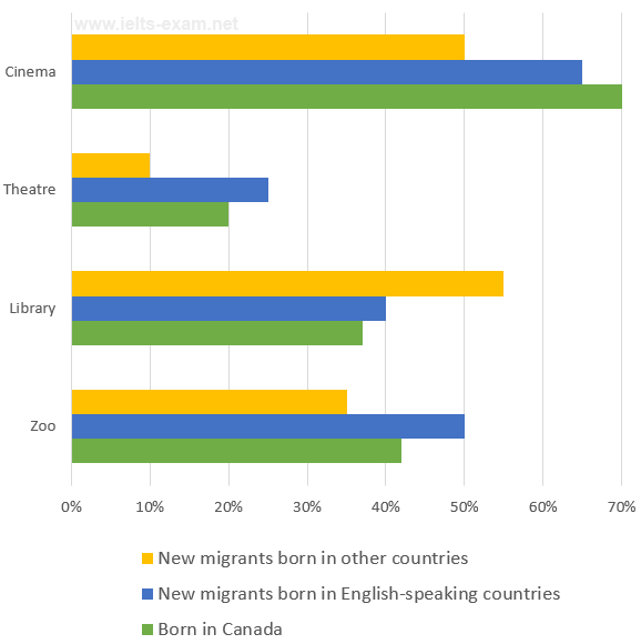
The chart below shows the places visited by different people living in Canada.
Summarise the information by selecting and reporting the main features, and make comparisons where relevant.
Percentage of people using multiple social networking sites
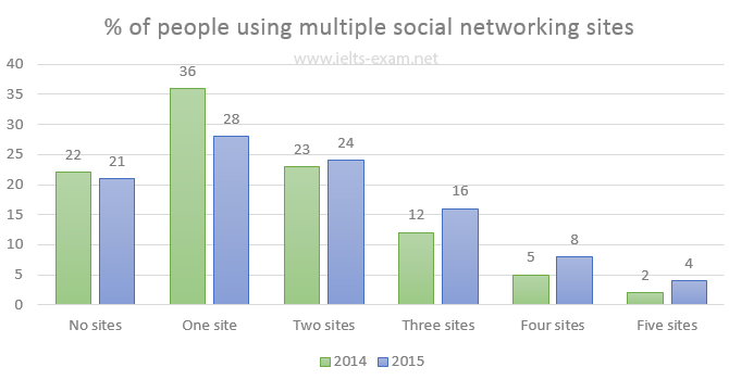
The chart below gives information about the number of social networking sites people used in Canada in 2014 and 2015.
Summarise the information by selecting and reporting the main features, and make comparisons where relevant.
Weight assessment of inhabitants of Charlestown 2015
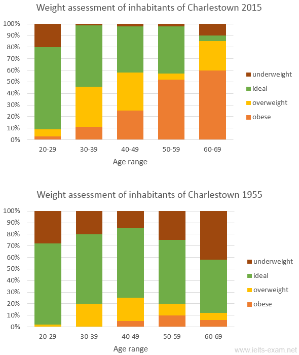
The charts summarise the weight measurements of people living in Charlestown in 1955 and 2015.
Summarise the information by selecting and reporting the main features, and make comparisons where relevant.
Someland's main exports
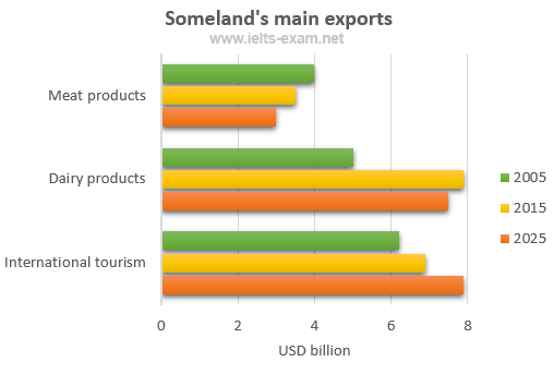
The chart below gives information about Someland's main exports in 2005, 2015, and future projections for 2025.
Summarise the information by selecting and reporting the main features, and make comparisons where relevant.
Sports played in New Zealand in 2002
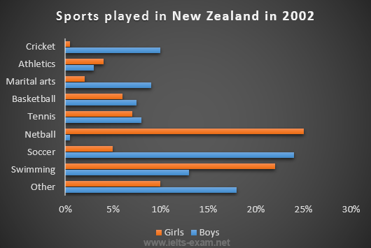
The chart below gives information about the most common sports played in New Zealand in 2002.
Summarise the information by selecting and reporting the main features, and make comparisons where relevant.
Science qualifications in two countries
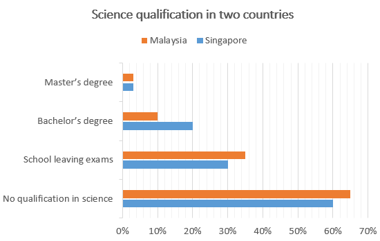
The chart below gives information about science qualifications held by people in two countries.
Summarise the information by selecting and reporting the main features, and make comparisons where relevant.
Students passing high school competency exams, by subject and gender
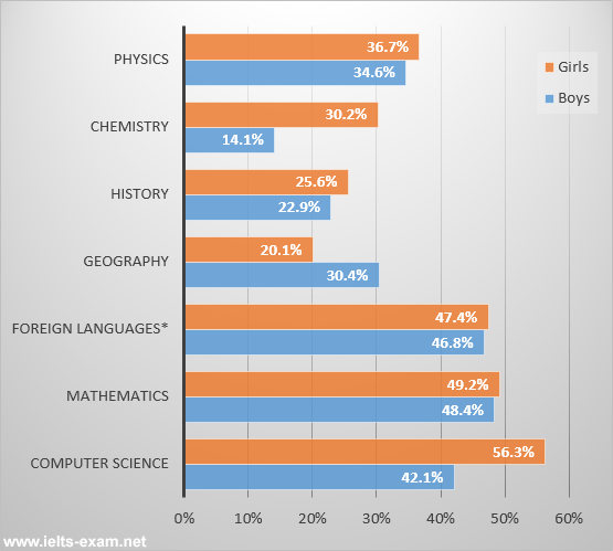
The bar chart shows the percentage of students who passed their high school competency exams, by subject and gender, during the period 2010-2011.
Summarise the information by selecting and reporting the main features, and make comparisons where relevant.
Female unemployment rates in the United Kingdom in 2013 and 2014
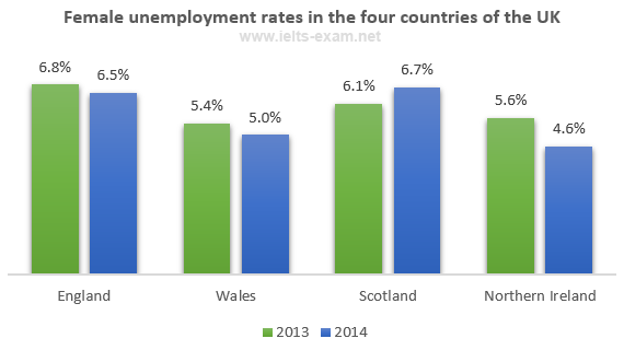
The graph shows female unemployment rates in each country of the United Kingdom in 2013 and 2014.
Summarise the information by selecting and reporting the main features, and make comparisons where relevant.
Percentage who watch reality shows and game shows
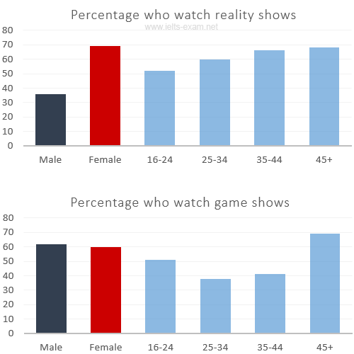
The charts show the number and genres of TV programmes watched by men and women and four different age groups in Australia.
Summarise the information by selecting and reporting the main features, and make comparisons where relevant.
Shares of expenditures for selected categories
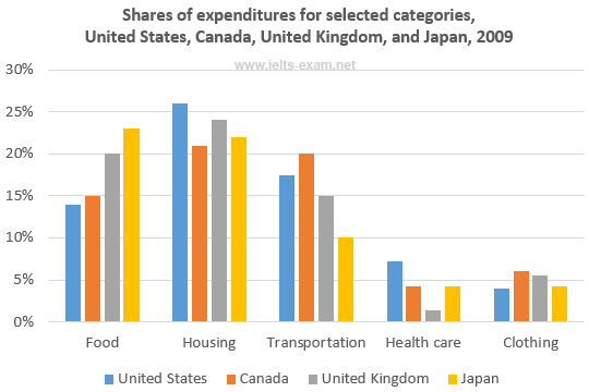
The bar chart shows shares of expenditures for five major categories in the United States, Canada, the United Kingdom, and Japan in the year 2009.
Summarise the information by selecting and reporting the main features, and make comparisons where relevant.
International graduates, Canadian universities, 2001 and 2006
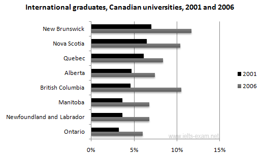
The chart shows the percentage change in the share of international students among university graduates in different Canadian provinces between 2001 and 2006.
Summarise the information by selecting and reporting the main features, and make comparisons where relevant.
Percentage of population aged 65 and over
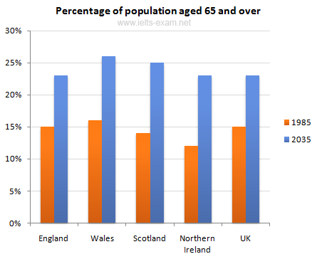
The chart gives information about the UK's ageing population in 1985 and makes predictions for 2035.
Summarise the information by selecting and reporting the main features, and make comparisons where relevant.
Percentage of pupulation in urban areas
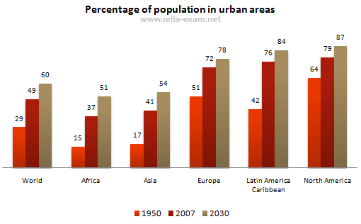
The bar chart gives information about the percentage of the population living in urban areas in the world and in different continents.
Summarise the information by selecting and reporting the main features, and make comparisons where relevant.
Urban populations in different world regions
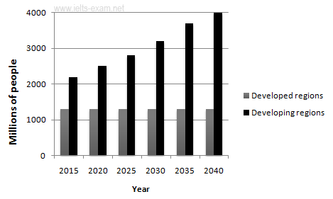
The graphs provide information on global population figures and figures for urban populations in different world regions.
Summarise the information by selecting and reporting the main features, and make comparisons where relevant.
The percentage of male and female teachers
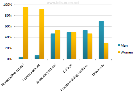
The chart shows the percentage of male and female teachers in six different types of educational setting in the UK in 2010.
Summarise the information by selecting and reporting the main features, and make comparisons where relevant.
Home and International Students
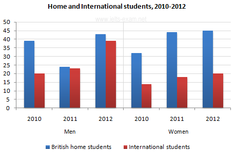
The bar chart gives information about the number of students studying Computer Science at a UK university between 2010 and 2012.
Summarise the information by selecting and reporting the main features, and make comparisons where relevant.
Finland's telephone calls, by category, 1995-2004
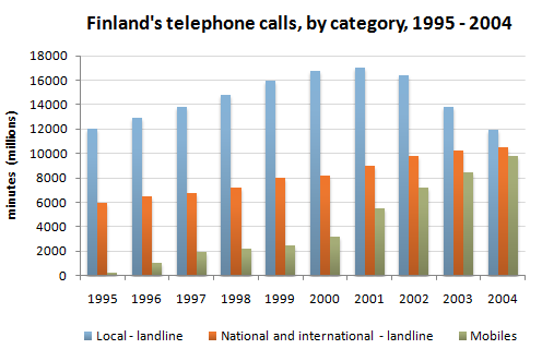
The chart shows the total number of minutes (in millions) of telephone calls in Finland, divided into three categories, from 1995 - 2004.
Summarise the information by selecting and reporting the main features, and make comparisons where relevant.